If you’re redesigning your eCommerce website or launching a new online store, it’s important to prioritize the customer experience – and follow best practices to maximize your conversion rate.
But what are these best practices? How can you build a user-focused website that builds user trust, encourages conversions, and still provides your customers with all of the information they need for an excellent eCommerce experience?
Great questions! In this guide from 121eCommerce, we’ll give you the answer – and look at 7 eCommerce design elements that will help you drive conversions, bring in more customers, and boost your bottom line.
1. A Streamlined Homepage

First impressions are everything in eCommerce. A streamlined, welcoming, and simple homepage is essential for maximizing your conversion rate.
A homepage, counter-intuitively, isn’t designed to get a customer to convert right away. Instead, it should be built to promote your products, show what’s unique about your store, and compel customers to start shopping and browsing right away.
The above screenshot from Big Blanket is a great example. It’s streamlined, sleek, and clearly communicates what the company sells – gigantic, comfy, and warm blankets. This homepage is even complete with a “SHOP NOW” call-to-action (CTA), as well as a CTA for a limited-time sale in the bottom-left, suggesting that customers can “Save up to $150” on their purchase.
2. Clear Calls To Action (CTAs)

A clear, obvious, and easy-to-find CTA (Call To Action) is the bedrock of any conversion strategy. On eCommerce stores, CTAs usually take the form of a “Buy Now” or “Add To Cart” button.
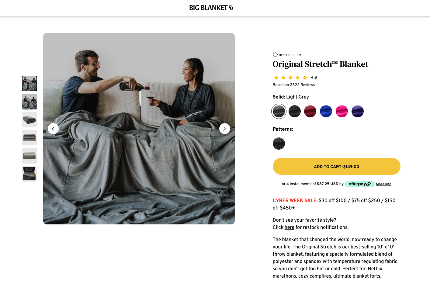
The screenshot above, also from Big Blanket, illustrates a few good principles of CTA design on product details pages. The CTA on this page:
- Is the only design element that’s yellow
- Contrasts well with the white background
- Is one of the only design elements to make use of CAPS
- Uses a rounded button that’s distinct from other buttons and design elements on the page
Because of these design choices, the eye is immediately drawn to this button, which makes it easier for a website visitor to add the product to their shopping cart.
3. One-Page Checkout
Converting a customer and getting them to add a product to their cart is great. But that’s not where the customer journey ends. You haven’t truly “converted” a customer until they’ve checked out and purchased your product.
That’s where shopping cart abandonment comes in. The average cart abandonment rate, based on 41 different studies, is about 70%. There are a lot of different factors that can affect cart abandonment rates, such as hidden shipping costs or taxes, or a website requiring a customer to make an account instead of checking out as a guest.
In addition to these issues, a major cause of cart abandonment is a long or overly-complex checkout process. According to the Baymard Institute, about 21% of people abandon their shopping carts because of a complex checkout process.
Implementing a one-page checkout system can help with this. By condensing the checkout process into a single page and simplifying it, you can ensure users are less likely to get “lost” or confused while checking out – and you can improve conversion rates.
4. Product Reviews

Social proof is an essential part of converting customers. You don’t just want a customer to visit your website and look at your products – you want to be able to provide them with proof that what you’re selling is worth their money. And there’s no better way to do that than with product reviews.
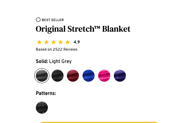
In the above example, again from Big Blanket, the star rating of the product is front-and-center and prominently displayed alongside other important information. Click the stars also functions as a hyperlink, bringing you to a selection of customer reviews:

This allows customers to quickly get an honest opinion about your product from real past buyers – which increases their likelihood of converting. After all, 9 out of 10 customers consult online reviews before making a purchase!
5. High-Quality Product Images
Using well-lit, high-quality product images helps build customer trust. Do your best to use professional photographs of your products, and provide as many angles and views of your product as possible so that your customers will know exactly what to expect.
Need some tips on what to do – and what not to do – when uploading product images? Check out this article from 121eCommerce and learn about the most common product photography mistakes to avoid.
6. Professional, Concise & Informative Product Descriptions
Visual appeal is all well and good, but customers also need informative, accurate, and professional product descriptions. If you don’t provide high-quality descriptions of your products, you could end up losing out on conversions.
How important are product descriptions? According to a 2017 study, 76% of shoppers said that “Product Specifications” were the most important thing on a product page, followed by “Reviews” at 71%, and “Images” at 66%.
Not only that, but the same study revealed that 98% of shoppers have been dissuaded from making an online purchase due to incomplete or incorrect content on the product page.
So if your product descriptions are riddled with typos, poor grammar, and incomplete information, your website can be beautiful, intuitive, and easy to use – but still fail to convert customers effectively.
Need some tips? Take a look at this blog post from 121eCommerce, and see how you can avoid some common product description blunders.
7. A Mobile-First Design
If you want to maximize conversion rates on your website, you need to make sure that your website is usable both on desktops as well as mobile devices like tablets and smartphones.
Today’s eCommerce customers don’t just expect to be able to shop on desktops and laptops – but on any device. And if your website can’t accommodate mobile browsing and checkout, you’ll end up missing out on a ton of conversions. By 2021, more than 54% of all eCommerce sales are expected to come from mobile devices.
In other words, if you don’t accommodate mobile users, you could end up losing more than half of your potential customers – and that’s definitely something you want to avoid. So make sure you use a responsive, reflowable, mobile-first framework when developing or redesigning your website – and ensure that your store offers an excellent experience on devices of all sizes.
Implement These eCommerce Design Elements – And Convert More Customers
If you take the time to properly implement these 7 eCommerce design elements in your store, you’re sure to convert more customers, reduce cart abandonment rates, and boost your overall sales.
Need more tips, advice, or suggestions on how to manage your eCommerce store? Check out the 121eCommerce blog – it’s full of helpful information that can help you improve your metrics, bring in more customers, and build a better eCommerce business.


Leave a Reply
You must be logged in to post a comment.