To pop-up, or not to pop-up? That is the question! Whether ‘tis nobler for the website to suffer from low conversions, or to take arms against the sea of bounce rates – and, by using a pop-up, end them!
Okay, please forgive our Shakespearean reference. (We got a bit carried away.)
But the question remains: Use pop-ups or avoid them like the plague? And it’s a hot topic among anyone who sells online that focuses on converting first-time visitors to paying customers.
Are pop-ups a good idea?
Do they really help increase conversion rates?
Should you use one on your website?
Let’s find out!
Pop-Ups Have Come a Long Way Since the Mid-2000s
We’ll come out and admit it now, before you read on. We’re pro pop-up. And the main reason for this is simple: pop-ups have come a long way since the days of innumerable windows opening up on Internet Explorer every time you opened up a new website.
Modern CSS and HTML has made it possible for pop-ups to be much less invasive. Rather than opening up an entirely new window – which is about the biggest internet marketing no-no there is – today’s pop-ups open within the same window, and are much less obtrusive.
There are also more options than ever for pop-ups, such as:
Modal pop-ups
Modal pop-ups are smaller and less obtrusive than their larger counterparts, and can open when a customer is scrolling through your website – encouraging them to sign up for an internet newsletter, contact customer support, or take some other kind of action.
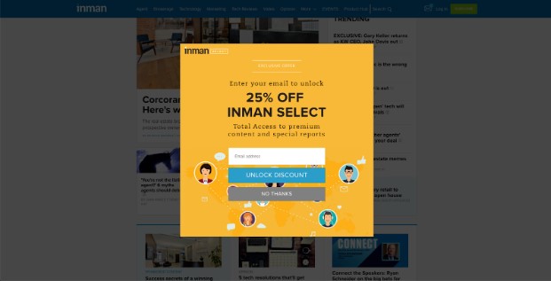
The below pop-up from real estate website Inman is a good example – and also incorporate a very good call-to-action.

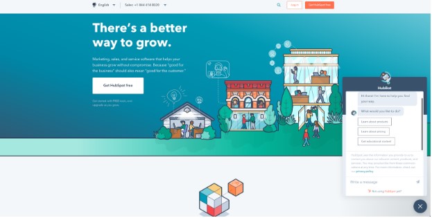
The pop-up below from Hubspot is another example of a different kind of modal window – a chatbot that lets prospective customers learn more about their products, if they want. It only appears after a certain amount of time, and can be easily dismissed, if desired.

Interstitial pop-ups

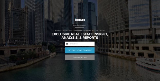
Interstitial pop-ups are more typically used to cover up the entire screen or the majority of it, often when entering a website, or when a user takes some kind of action – like moving their mouse towards the “back” button. Again, this is a good example of an effective pop-up – there is a clear call-to-action, and an easy way to close the pop-up and continue to the site.
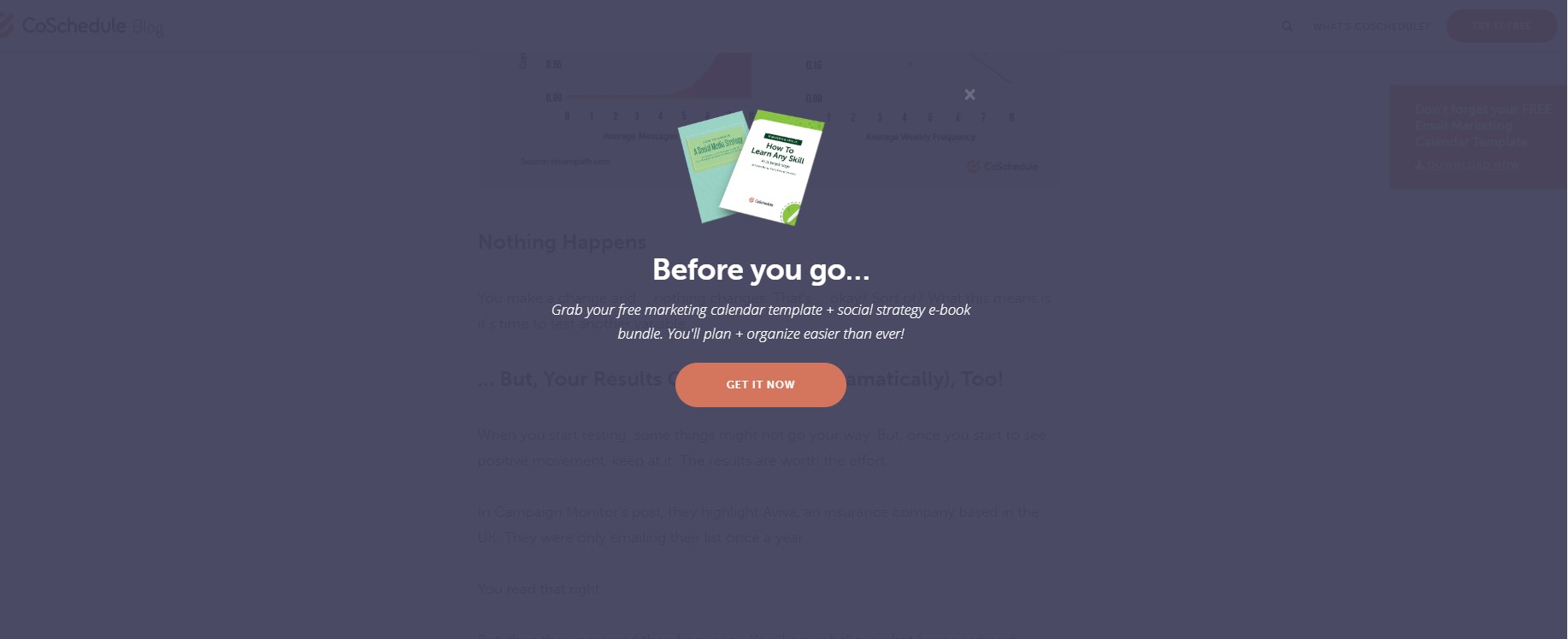
Here’s a pop-up I recently was served up when I headed for the exit button:

Yes. It’s a last-ditch effort to stop me from leaving and grab some of my info. But it is effective. (It stopped me 😉
There’s a Reason Pop-Ups are so “Pop”-ular
Today’s pop-ups are much less likely to provoke negative reactions in web users because they’re common, easy to exit, and don’t cause annoying, extra windows to appear.
What does this mean for you? It means that they are more effective. In fact, properly-designed pop-ups can boost your conversion rate to 9% or higher.
Today’s Pop-Ups Are Also Versatile and Can Be Deployed in Numerous Ways
One of the other benefits of using pop-ups in your site is that, thanks to modern web technology, there are a number of different ways they can be deployed – which allows you to create a unique pop-up strategy that’s right for your website.
Some of your options include:
- “Welcome Mat” pop-ups – These pop-ups appear as soon as a user clicks on your website for the first time. While some users find this obtrusive, the numbers don’t lie. This is a great way to convert new customers by getting them to sign up for a coupon, special offer, or email newsletter. A study done at Fedora showed that sign-ups for a webinar soared by more than 70% with a welcome mat pop-up.
- Scroll-initiated pop-ups – These pop-ups trigger after the user has scrolled down to a particular area on the webpage. For example, if they’re reading a customer support webpage, a modal pop-up could appear, allowing them to request help from a representative immediately.
- Timed pop-ups – These pop-ups will appear after a designated period of time, allowing the user to browse some of your website’s content – and then provide them with a special offer, intended to get them interested in your products or services. You can change this time cutoff, but since most people decide to leave or stay on a page within the first 10 seconds of their visit, we recommend keeping the timer low – somewhere between 5-10 seconds. Of course, you can A/B test this on your own, and find out if there’s a better “sweet spot” for your own website.
- Exit intent pop-ups – These pop-ups can be very useful for eCommerce stores. If your user is browsing your website, and moves their mouse towards the back button, or the exit button, you can trigger a special pop-up alert – and give them a special opportunity, coupon or other promotion to change their mind, and convert them into a paying customer.
Don’t Get Carried Away – Follow Best Practices For Designing Pop-Ups
Despite the benefits that pop-ups offer, it’s still important to be wary when designing pop-ups for your website. You don’t want users to become frustrated or confused, and confronted with a half-dozen pop-up windows when they’re just trying to browse your website without interruptions.
That’s why we recommend the following pop-up design best practices:
- Limit yourself to just 1-2 pop-ups, particularly if you’re using interstitial pop-ups that take up the whole screen.
- Only show homepage pop-ups once. After a visitor exits the pop-up, don’t try to serve it to them again when they come back to your homepage – this is frustrating and just makes it harder for them to use your website.
- Use a clear call-to-action, bold colors, and relevant offers to increase pop-up conversion rates.
- Give the customer a reason to click the pop-up. A coupon, a reward, an exclusive eBook – something that will make them more likely to actually convert, rather than just exit the window.
- Don’t re-use the same pop-ups. Try to create several, visually-distinct pop-ups. For example, you could have a “welcome mat” pop-up that invites users to join your newsletter, and an exit intent pop-up that provides them with an exclusive coupon. By varying your pop-ups and offers, you can help ensure that users don’t just blindly click away from your promotional offers whenever a pop-up appears.
A Final Thought: Don’t Fear the Pop-Up.
When properly designed, used, and executed, a pop-up can be a powerful tool for converting more customers on your website.
So, in our humble opinion, you should make use of pop-ups when you can – as long as you’re serving up relevant, useful content that has something to offer for your customers. By doing so, you’ll be able to increase your conversion rate and sales, and enjoy bigger profits on your store or website.
Interested in more tips about on web design, marketing, and eCommerce? Check out the 121eCommerce blog, and get even more tips, tricks, and advice about building your Magento store – and selling your products more effectively.


Leave a Reply
You must be logged in to post a comment.